Project: Hair Bliss Logo & Label Design

Client: Hair Bliss – Natural Hair Oil & Serum Company
Project Type: Logo Design, Label Design

Hair Bliss

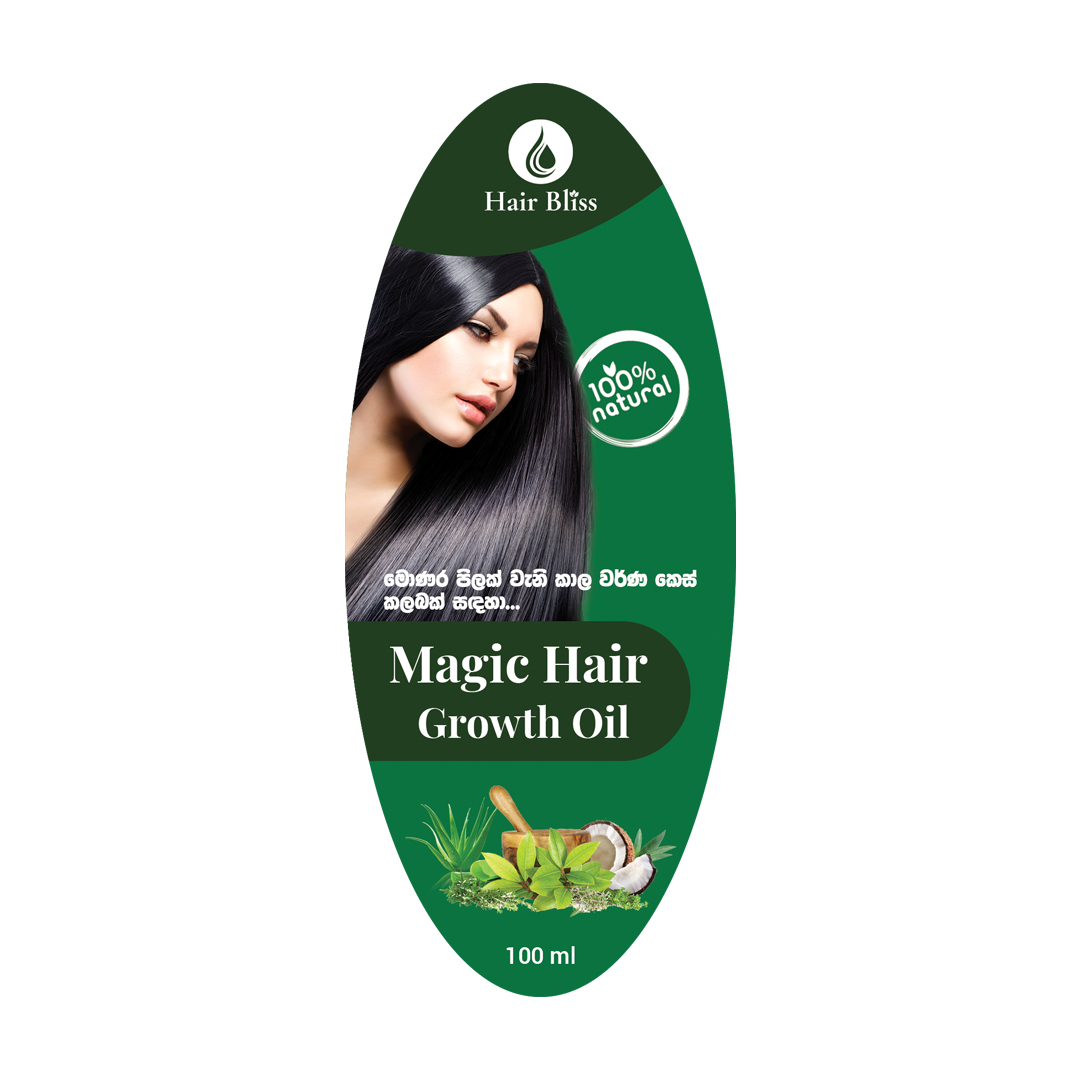
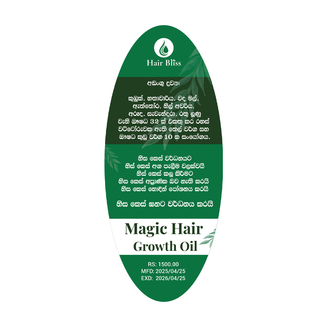
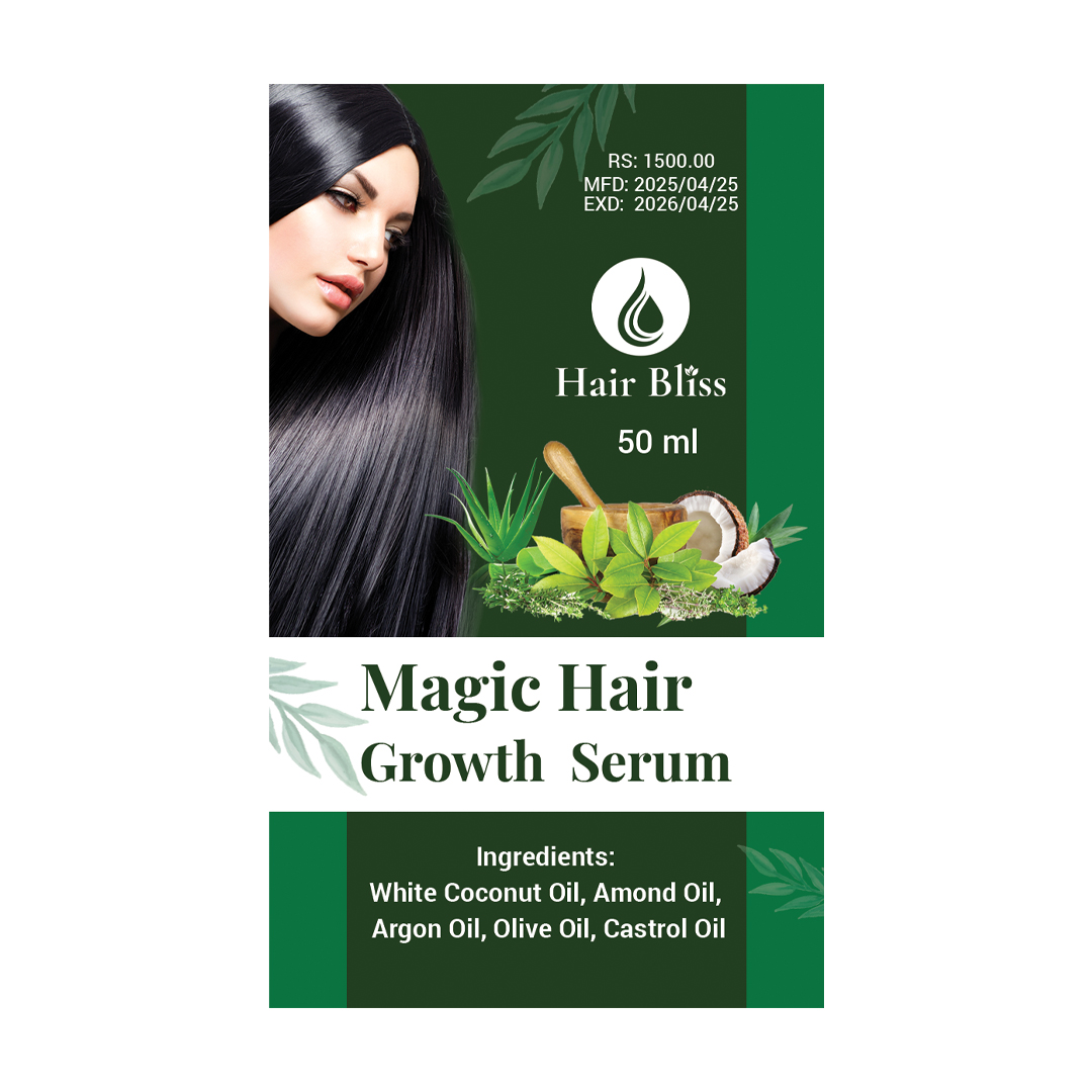
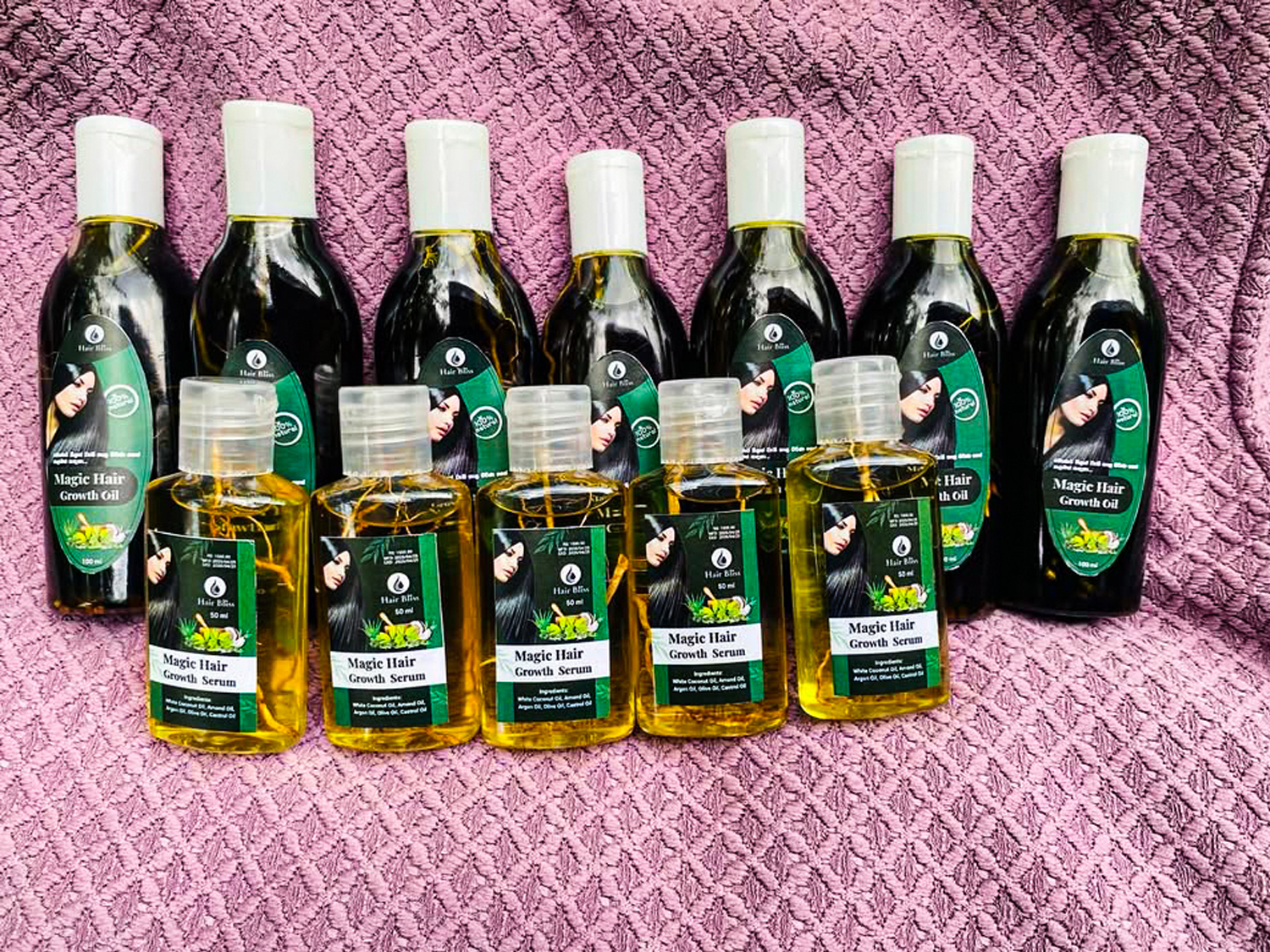
Hair Bliss is a nature-inspired haircare brand offering nourishing oils and serums made from pure, plant-based ingredients.

Hair Bliss is a natural haircare brand dedicated to nourishing hair from root to tip using the power of nature. Specializing in premium hair oils and serums, Hair Bliss is committed to delivering chemical-free, plant-based solutions that restore shine, strength, and overall hair health. Blending tradition with modern care, every product is crafted to bring out the natural beauty of your hair — the way nature intended.

Rooted in purity and powered by natural ingredients, Hair Bliss believes in clean beauty, eco-conscious living, and holistic hair wellness.

Project Overview:

Hair Bliss is a nature-driven haircare brand specializing in oils and serums formulated with natural ingredients. The client approached us with a clear vision: a brand identity that reflects purity, wellness, and nature. As the creative lead, I was responsible for designing the logo and product label, ensuring the visual identity aligns with the brand’s natural and organic positioning.

Client Request:

The client specifically requested a “natural” look and feel, and we delivered a harmonious blend of nature and beauty through thoughtful iconography and color psychology.

Objectives:

  • Create a minimalist, clean, and nature-inspired logo

  • Design a label that reflects the brand’s organic, trustworthy, and premium image

  • Use green color palettes to communicate freshness and plant-based ingredients

Design Elements:

  • Hair Icon: Represents the core product focus – hair care
  • Oil Drop Icon: Symbolizes nourishment and the core product ingredient
  • Leaf Icon: Emphasizes nature, sustainability, and organic roots
  • Color Palette: #0d9347 – a deep, earthy green to convey natural beauty, growth, and health

Why This Works:

The combination of icons delivers an instant visual message – this is a nature-based solution for hair care. The green palette evokes trust and cleanliness, resonating with environmentally conscious consumers. The minimal yet expressive design ensures strong shelf presence and digital visibility.

Outcome:

  • A cohesive brand identity that speaks directly to the target audience
  • Increased product shelf appeal and professional brand perception
  • Positive feedback from client and their early customers